
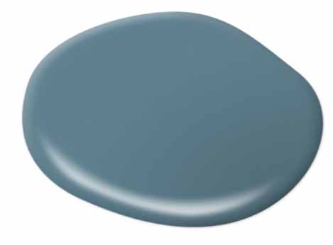
It's always exciting when a brand announces its Color of the Year, but let's be honest, sometimes, we're unsure of the best way to incorporate it into our own design scheme. Thankfully, that's not the case with Behr Paint's 2019 Color of the Year: Blueprint.
Blueprint, available exclusively at The Home Depot, is a mid-tone blue that Behr's in-house color expert, Erika Woelfel, believes is universally appealing, as it's "warmer than denim and softer than navy." Woelfel says the company found inspiration in industries like fashion and hospitality when settling on this year's color choice. "It symbolizes our desire for positive energy, stability and confidence, both at home and out in the world," Woelfel says. "It’s a hue that will stand the test of time."
So what's the best way to use Blueprint in your own home? According to Woelfel, the possibilities really are endless. Try the calming paint hue for bathroom, bedroom, kitchen or living room walls. But if you're more reserved, experiment with a much smaller project. "If you’re looking to reimagine your space in a smaller way, try painting a piece of furniture like a coffee table or bookshelf in this classic blue," Woelfel advises.
The brand has also taken it a step further by crafting a 2019 Color Trends Palette, highlighting the best hues to pair with Blueprint. Using Blueprint as the base, Behr created four different palettes to help guide consumers in weaving the hue into various rooms. Color Binge is full of drama with its monochromatic hues ranging from teal to deep navy. Inspired Curation is for lovers of a more modern aesthetic and includes jewel-toned pairings like warm gold and deep green. Down to Earth is all about neutrals and earthy browns. And finally, Soft Focus highlights on-trend pastels like blush peach and lilac.
And as if that's not enough, here are a few more creative ways to incorporate Blueprint into your home.
Pair it with Moody Hues
Blueprint is the perfect shade to combine with rich hues like olive and brown, as shown in this 1970’s-inspired living room. It's a great backdrop for a living room accent wall, but is also versatile enough to be used on all the walls if you love nothing more than a bold design scheme.
Play Up Its Calming Vibe
"Blueprint is a classic blue and the perfect choice to create a feeling of comfort," Woelfel says. Blue typically has a calming effect, which makes it a fail-proof shade for a bathroom.
When in Doubt, Try a Monochromatic Look
If you're partial to monochromatic design schemes, look no further than Blueprint. "In this photo, we layered shades of blue and teal on the walls, textiles, and décor items to give the living space an immersive feel," Woelfel says.
Make it the Base
"One of the benefits of Blueprint is that it takes on different personalities when paired with different hues," Woelfel says. "Here, it serves as an anchor for a trending warm gold sofa and muted peach hue on adjacent wall. With Blueprint as the base, the design directions are endless."
Take it Outside
According to Woelfel, Blueprint embodies positivity, so it makes perfect sense for the exterior of a home. "Using it on the front door not only increases the curb appeal of your home, but it sends out a message of positive energy, stability, and confidence for each guest that enters," she says.
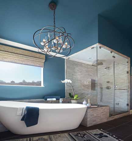
Add Depth to a Cozy Bathroom
Blue hues are ideal for bringing a sense warmth to a cozy bathroom. "Classic and refined, Blueprint adds the right amount of depth and brightness to this bathroom," Woelfel says.
Experiment with a Color Gradient
"There is something both soothing and exciting about the harmonious blending of colors," Woelfel says. "Color gradients, like the gradient shown in this bathroom, create visual interest and can increase the height of a space when a darker shade is used on the bottom."


Your Message